Michael Dunst
University of Pennsylvania Master of City Planning student
Passionate about and skilled in transportation planning, real estate development, and creating livable cities.
View My LinkedIn Profile
Rethinking and Visualizing What a “City” is
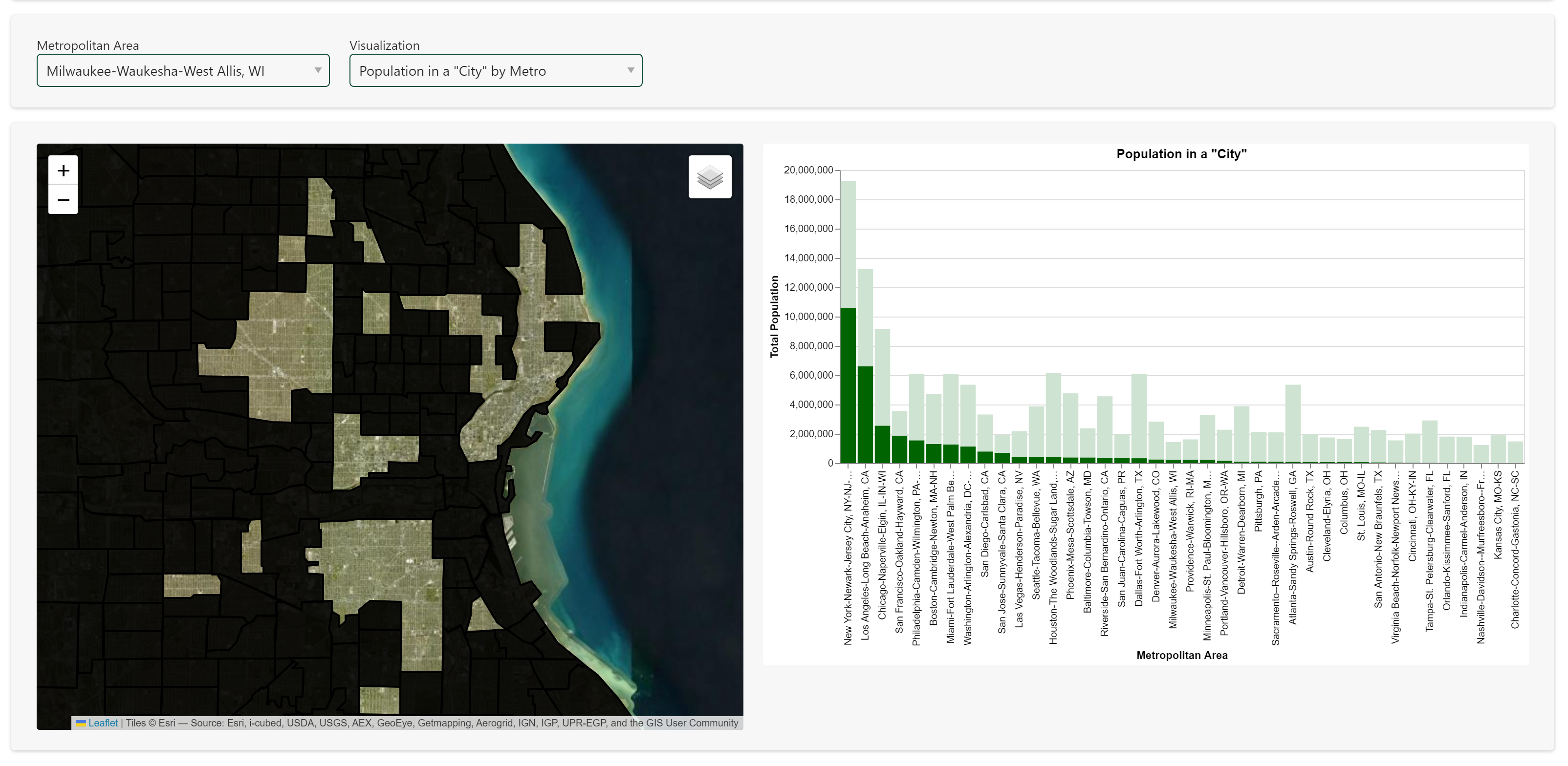
Project description: As I sat in a presentation about Jacksonville, FL, where they touted their rank at the top of the largest (geographic) American cities, I thought about how we can define cities when political boundaries lead us astray. To me, using an objective density metric could give people a better idea of where “real cities” are in the United States. To accomplish this, I wrangled Census data, created an interactive dashboard, and published it online.
You can access it here: https://mtdunst-how-city-is-your-city.hf.space
Behind-the-scenes
1. Data wrangling
While the tidycensus package for R is incredible useful, it lacked the ability to easily query at the tract level with attributes for each tract’s metropolitan area. To navigate around this obstacle, I created a nested set of loops that ran through the top 40 largest MSAs and got the needed information at the tract level.
2. Creating a dashboard
While I initially considered making a static image of a city, I decided that people would be much more interested in being able to look at their hometown and see which parts of it were a “city” or not; they could relate their own experiences to what this mechanism said. Using Panel and Altair in Python, I created a dashboard that lets you choose a city and compare it to bar charts of various metrics.
3. Publishing a website
Using interactive functionality is quite simple within a Jupyter Notebook, but getting it out into the world is much trickier. Using the Docker framework for Hugging Face, I created my own site that hosts this dashboard. To give a sneak peek, I made a quick screen-recorded video showing the dashboard’s functionality in a LinkedIn post.